Indifference Curve. Isocost. Isoquant. If you’ve taken Microeconomics in uni and you feel the dread, I feel you. I was very interested in economic theory and consumer behavior but once my professor threw me those indifference curves, I was done ya’ll. No chance. Too much complexity and graphs to what I think could be explained simply and intuitively. Perhaps the word on the streets that economists suffer from Physics envy has merit?
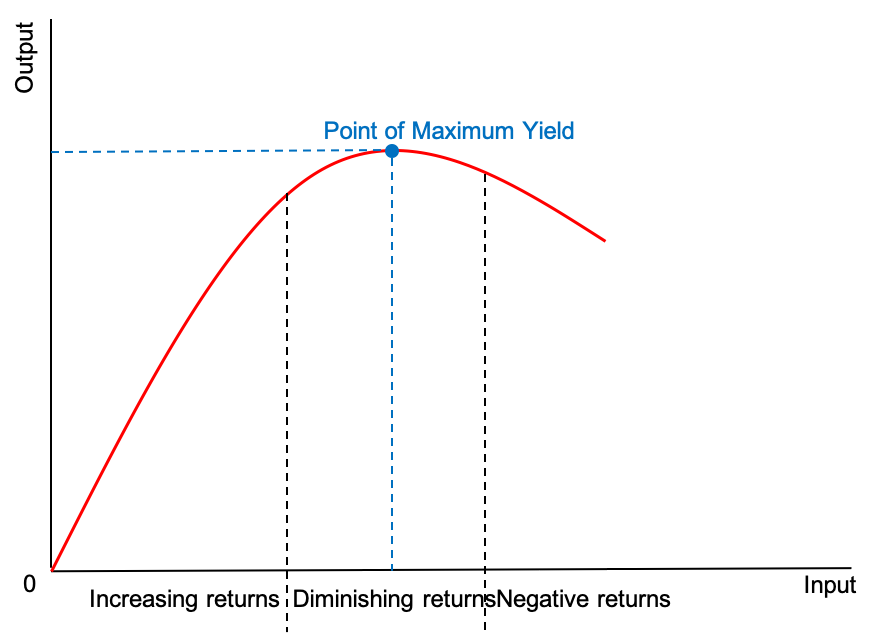
I might not remember what an isoquant is, but there was one concept from that microeconomics class that stuck with me – the law of diminishing marginal return. This law states that “if more variable input units are used along with a certain amount of fixed inputs, the overall output might grow at a faster rate initially, then at a steady rate, but ultimately, it will grow at a declining rate(source).” The graph looks this:

Source: Wikipedia
Let me break this down. You have a 200 square meter baking facility. You have 4 ovens, a slew of baking equipment, work stations, raw materials and etc. You initially have 4 bakers. If you add 4 more bakers, your production should increase. But if you have 30 bakers in that 200 sqm facility and everything else is the same, you would end up with negative returns on productivity. Why? Too much drama and politics amongst 30 people in a space not big enough for them. There should be an optimal number of bakers that the baking facility could handle. The returns for each additional baker is negative if it is above that optimal number.
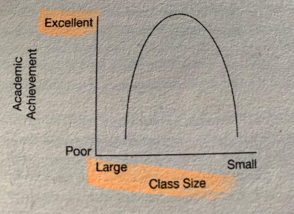
Malcolm Gladwell in his book David and Goliath talks about an inverted-U curve. Many believe that big class sizes are detrimental to academic performance and that small class sizes are ideal. Nevertheless, Gladwell suggests that as classes become too small academic performance suffers. Too small class sizes leads to dominant personalities taking over on top of less group discussions and diversity. The graph of academic achievement and class size looks like this:

Source: David and Goliath by Malcom Gladwell
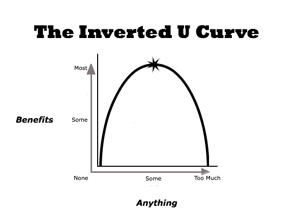
The law of diminishing marginal returns is an inverted-U curve! The inverted-U is a fascinating concept because we can change the X and Y axis into other ideas and it will make sense. Look at the graph below:

Some ideas that I can put in an inverted-U curve:
Training and athletic performance
You don’t train enough and you suck. You train too much and your performance suffers. Google “overtraining” and you’ll see what I mean.
Music and performance
You don’t practice the guitar enough and you will suck. Practicing too much leads to injuries and no additional benefit. I have personally experienced negative benefits from practicing too many hours on the guitar. My optimal time is 1.5 hours.
Studying and cognition
You don’t study enough and you will fail the test. Too much studying leads to cognitive overload and stress.
Food and health
Not enough food and you suffer from caloric deficit. Too much food and you are obese.
Sleep and well-being
Too little sleep and you’re a walking zombie. Too much sleep and you feel lethargic and lazy.
User experience and design
Not enough features and your users will think your app sucks. Too much features will overwhelm your users.
TL;DR: Too much and too little of anything is not good.
